Box Shadow
The box-shadow property is used to add one or more shadows to an element. It allows you to create visually appealing effects, such as giving the illusion of depth or highlighting elements.
The syntax for the box-shadow property is as follows:
 h-shadow v-shadow  blur spread  color
    |       |      |      |       |
box-shadow: 5px 5px 5px 2px #808080;
-
h-shadow : The horizontal offset of the shadow. A positive value puts the shadow on the right side of the box, and a negative value puts the shadow on the left side.
-
v-shadow : The vertical offset of the shadow. A positive value puts the shadow below the box, and a negative value puts the shadow above.
-
blur : The blur radius. The higher the value, the more blurred the shadow will be.
-
spread : The spread radius. A positive value increases the size of the shadow, and a negative value decreases the size.
-
color : The color of the shadow.
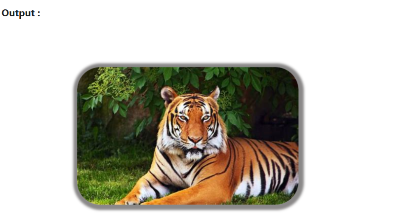
In the third example you provided, you want to add a box shadow to an image. Here's the code:
Code :
<html lang="en">
  <head>
    <title>img shadow</title>
    <style>
      .img-tiger {
        height: 300px;
        border-radius: 50px;
        margin: 30px;
        box-shadow: 2px 2px 5px 10px rgb(138, 136, 136);
      }

      .img-tiger:hover {
        border-radius: 20px;
        transition: 2s;
      }
    </style>
  </head>

  <body>
    <img src="tiger.png" class="img-tiger" alt="img" />
  </body>
</html>